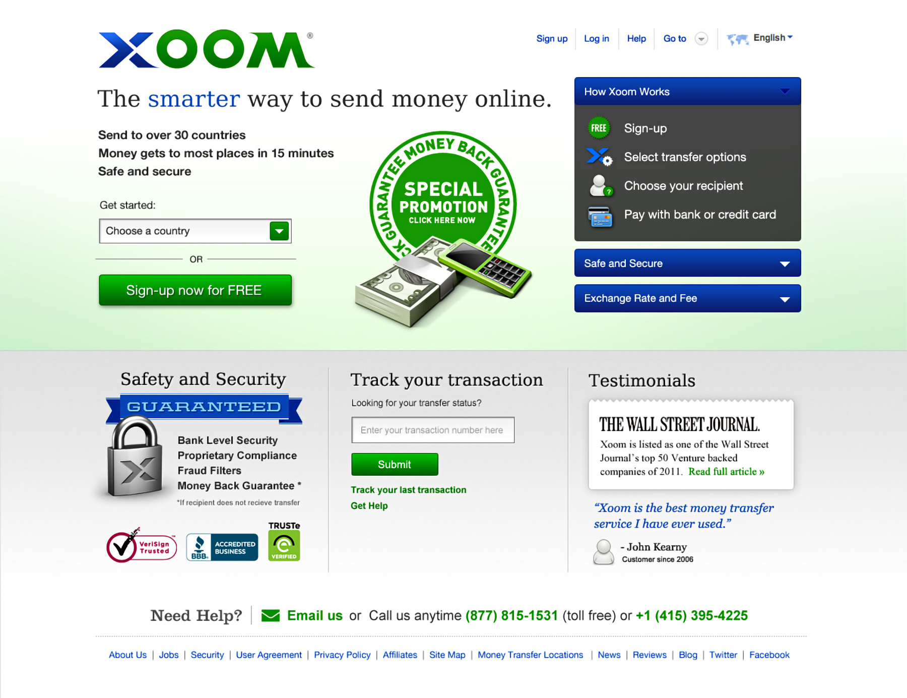
Xoom
Xoom is an international money transfer service that allows users to easily send money, pay bills, and reload phones all around the world.


Xoom is an international money transfer service that allows users to easily send money, pay bills, and reload phones all around the world.

Phase 1: Polish
As a stop-gap solution we made minor adjustments to the aesthetic of the landing pages that would buy time to address more critical issues in phase 2 of the redesign. Doing as much as possible without any html or layout change was fairly straightforward. One change I was earnest to push was consolidating global navigation into a unified header and adding currency selection in the form.
Phase 2: Radical
When a user hits the homepage for the first time there is insufficient information to populate contextual content on the page. Trying to execute or initiate a transaction immediately is a stretch. Instead we determined that reinforcing the value proposition, bubbling up marketing information, explaining the process, and funneling into the appropriate country specific landing page is the most effective flow.

Guro Design openned our eyes to the effectiveness of good design. We worked together on a design project to gain trust and legitamacy to new users on our site. With the new design there was a 20% uplift of new user accounts. We no longer take pixels for granted.
