SurveyMonkey
A change in direction to the world's best survey platform presented a great design opportunity and a way to reinvigorate a long established brand.

ROLE
CONTRIBUTION
- Produce wireframes and high fidelity mockups
- Design layouts based on existing CMS capabilities
- Prototype improvements to site functionality
- Graphic elements and icons
- Pitch deck and presentation design
Overview
Survey says...
Brand Refresh
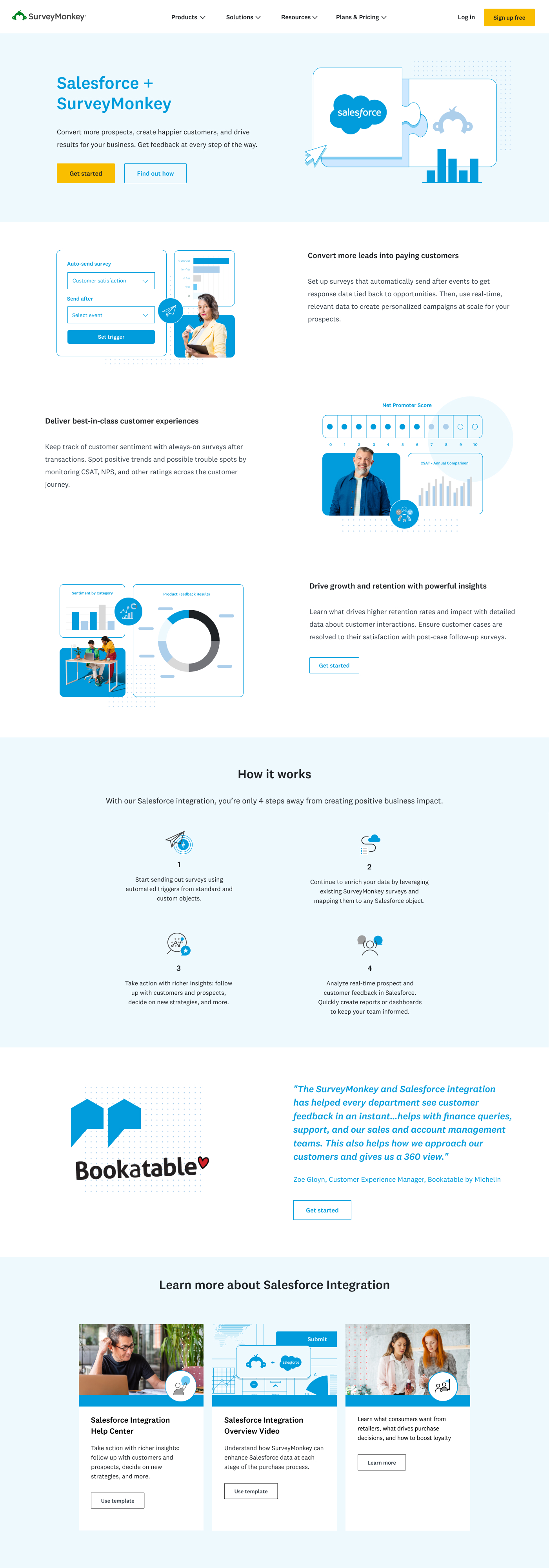
SurveyMonkey was in the midst of a leadership change and brand reorganization. They spent the past few years building distinct business units for their consumer, enterprise and data products under the umbrella brand, Momentive, but the new direction involved consolidating the brands back into the singlular SurveyMonkey entity.
To recognize the re-org, it was necessary to launch an updates to key pages to reflect the change. It was an opportunity to change the creative that had not been updated for some time. You can swipe and see how the approved concept updated the old homepage, and below you can find the interactive concept that I was trying to sell.
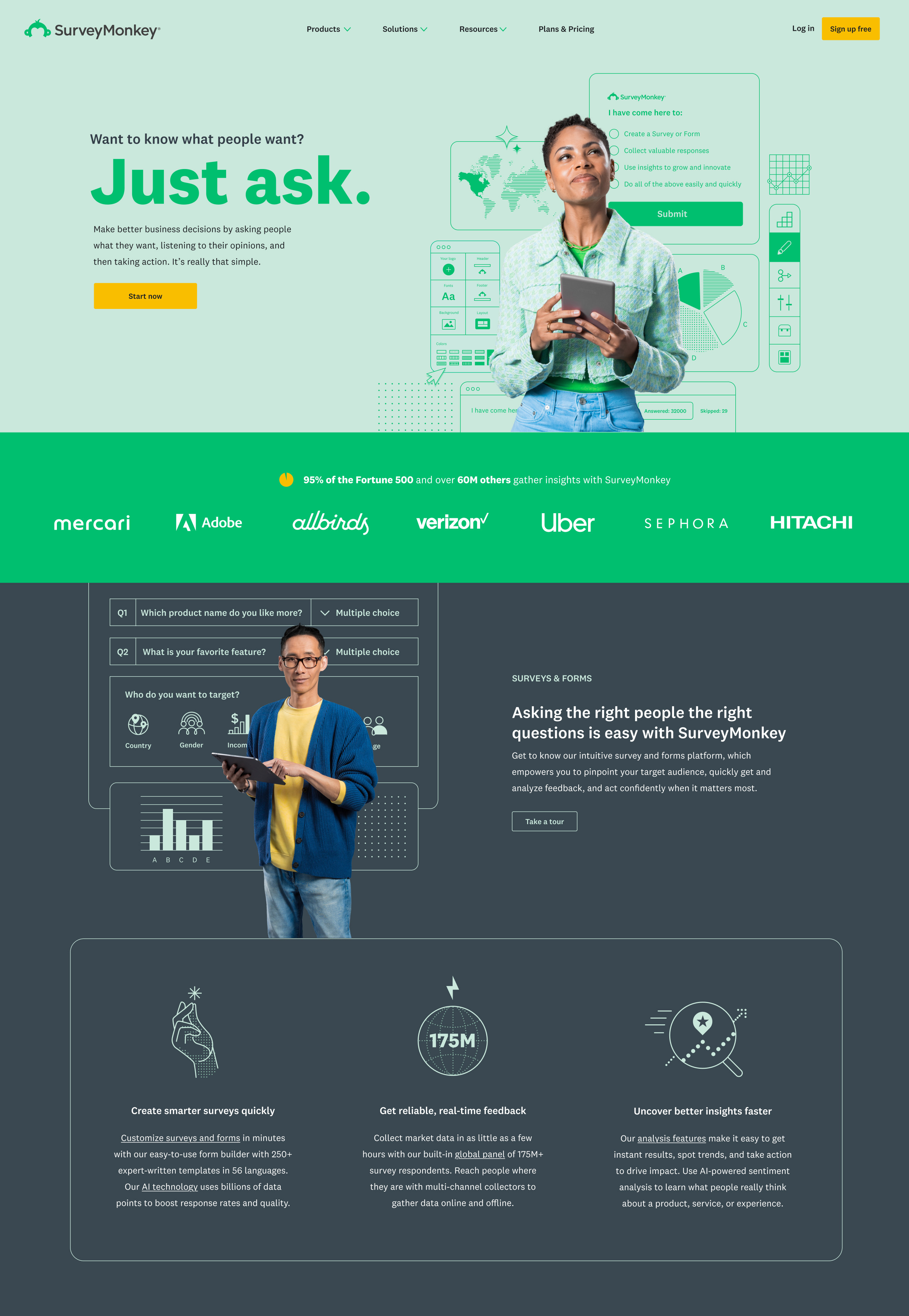
I was hoping to inject some personality into the brand with a new homepage concept, something that could be improved upon and resonate alongside the playful name. Out of a handful of concepts one stood out to me. It involved some subtle interactivity that would showcase the product and value proposition at the same time.
It revolved around embedding a mock survey in the hero area. Each multiple choice option would be a core user intention (the final answer being all of the above). Every selection would result in a form response detailing the associated value proposition and each answer would laterally lead to the other value propositions and inevitably end at the 'All the above' result with a sign up form.
By skewing the axis of the form and surrounded it with graphics, it was emphasized as a visual element rather than an actual working survey making it a bit of an easter egg. To stay playful and define a visual style I incorporated animated patterns in the background that would move and rotate organically. As they passed under the hero module I would use an svg filter to blur them to maintain legibility.
Marketing dilemma
A Product Design Gap
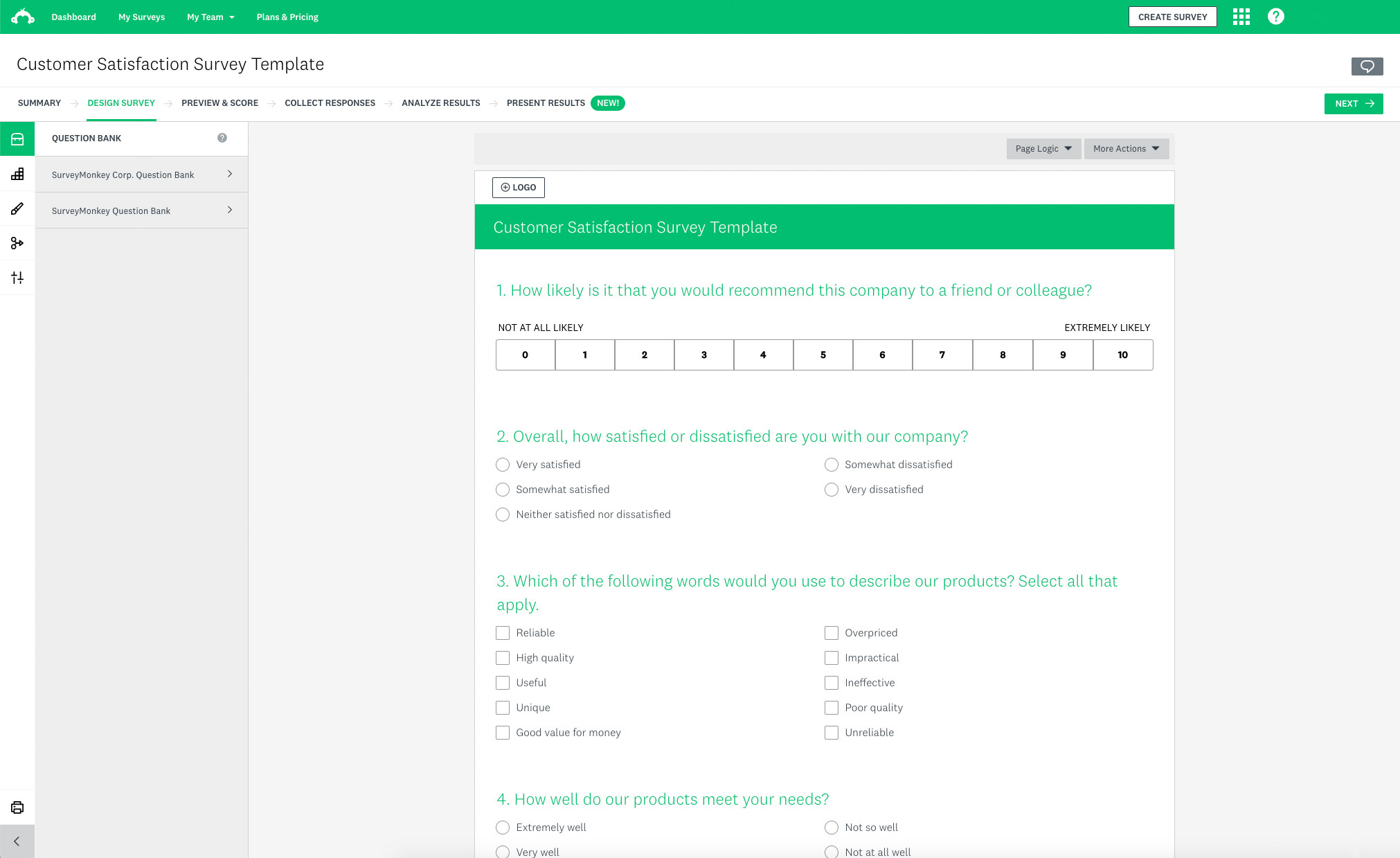
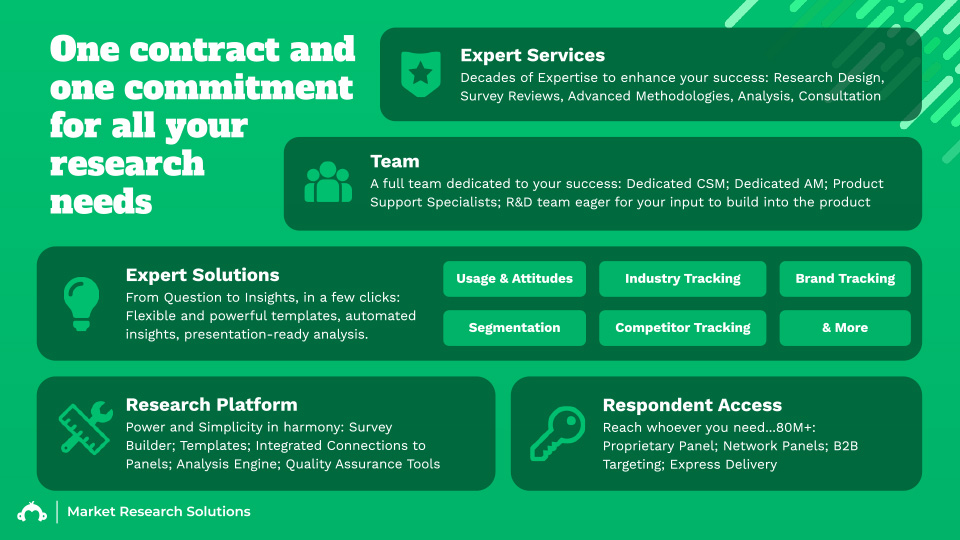
The core direction of the visual design was to incorporate more UI graphics to reinforce feature propostion, problem being that the presentability of product shots was lacking. The brand design team were designing UI mock-ups specifically for marketing use only. This felt necessary, but disingenuous seeing that they lacked parity with the design of the in-use product. Product shots were being incorporated as core visuals without any additional flourish which made it feel dry.
Instead using the UI components as secondary imagery seemed to work well and bred a visual style, something that was lacking from the existing site. I opted for a line driven style incorporating the range of brand colors. Photographic imagery would be used a visual anchor while the stylized UI components would add consistency across the visual content.
The land of ...
Landing Pages
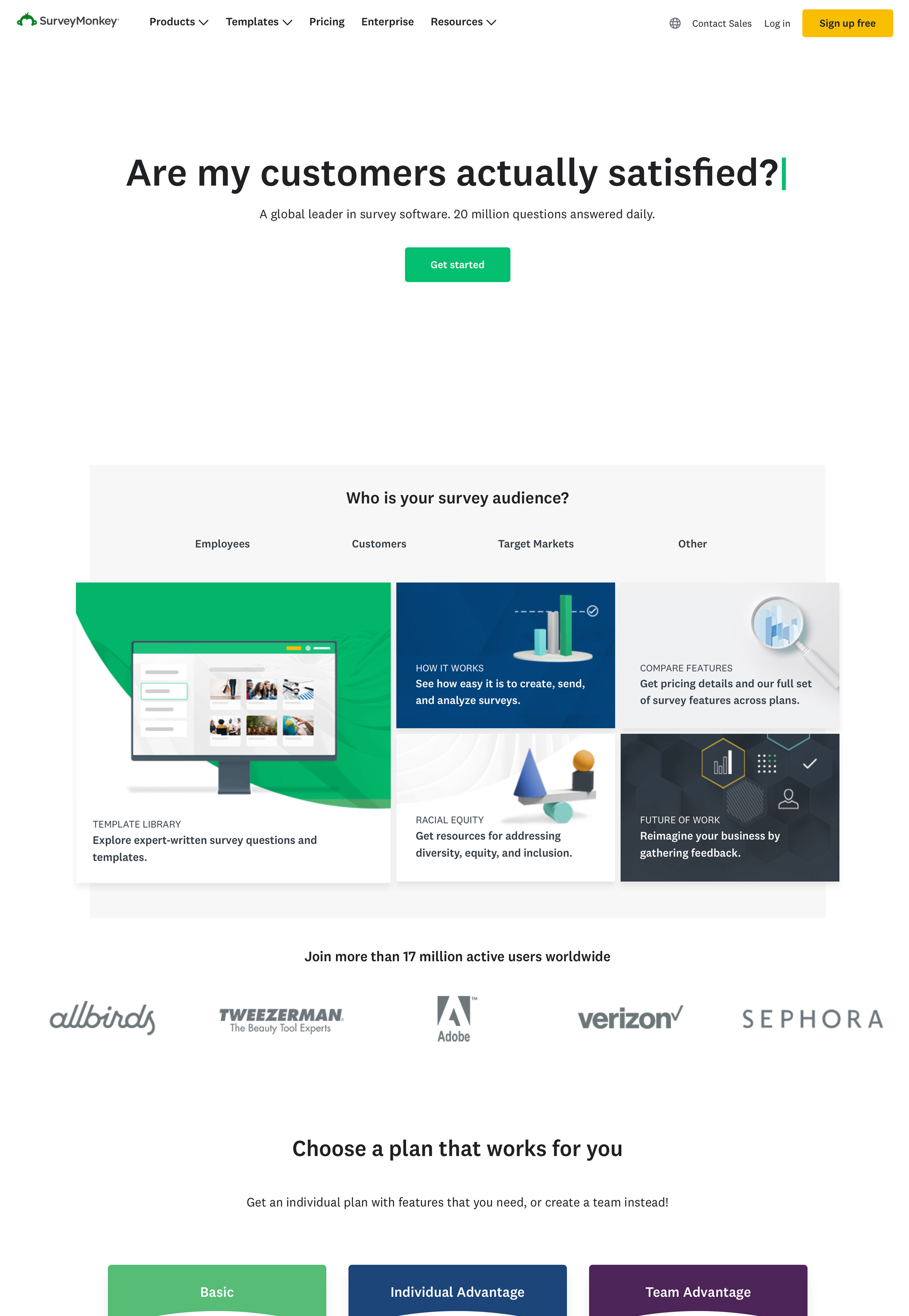
There were dozens of landing pages and side doors funneled through paid search. All of these would also need updated content and imagery for a unified launch.


Brand assets
Workin' with what you got
Attempts at incoporating net new creative we're met with resustance as keystakeholders were on leave. To maintain brand consistency I tapped into their brand photo resource and composited them with site elements creating something new yet recognizable.


SurveyMonkey
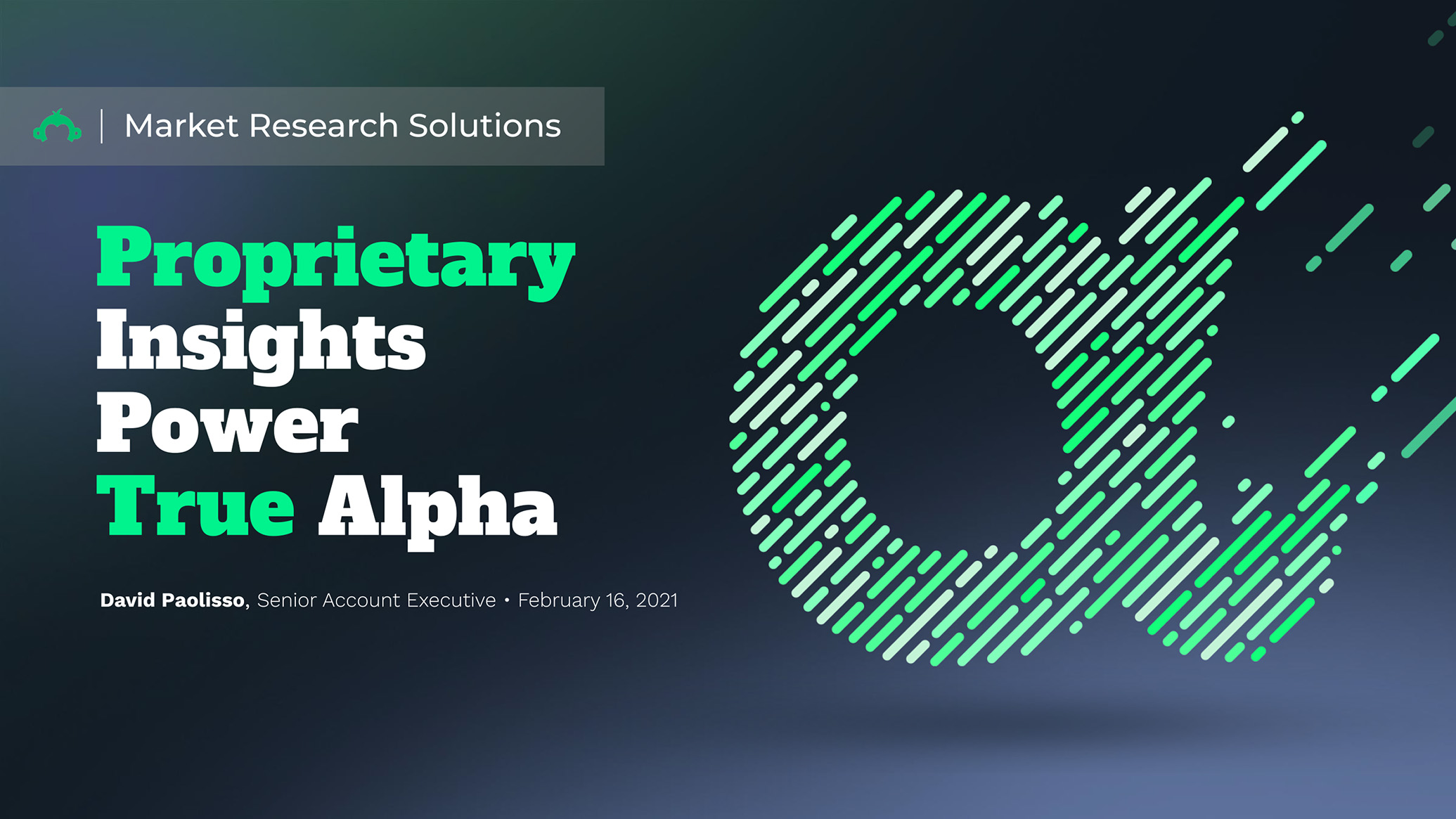
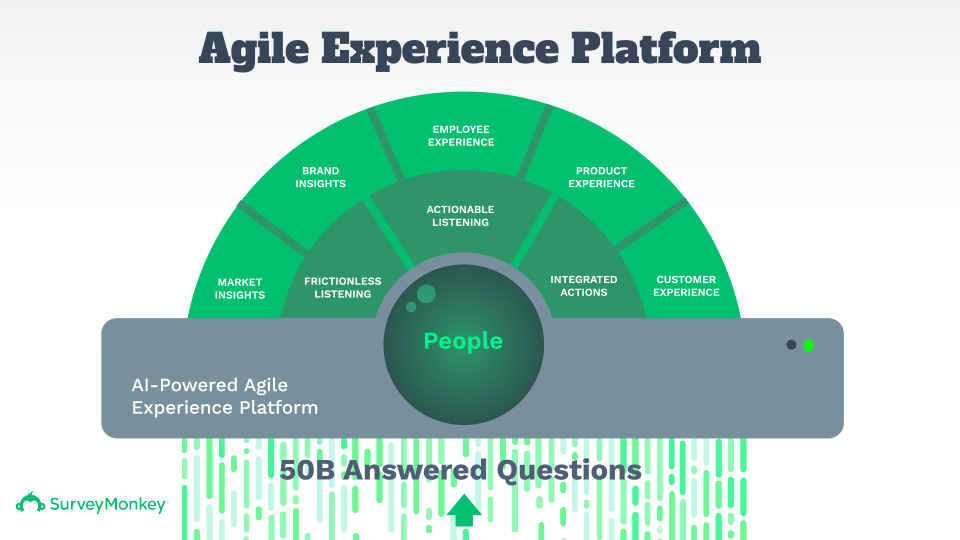
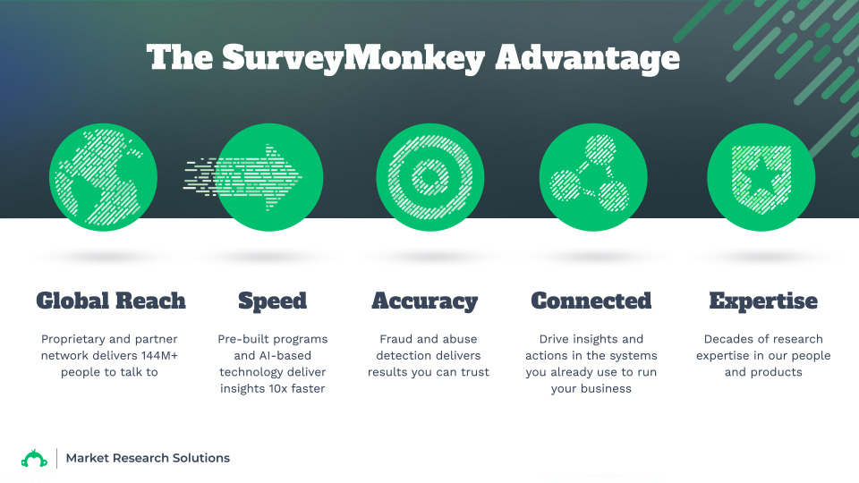
Market Research Solutions
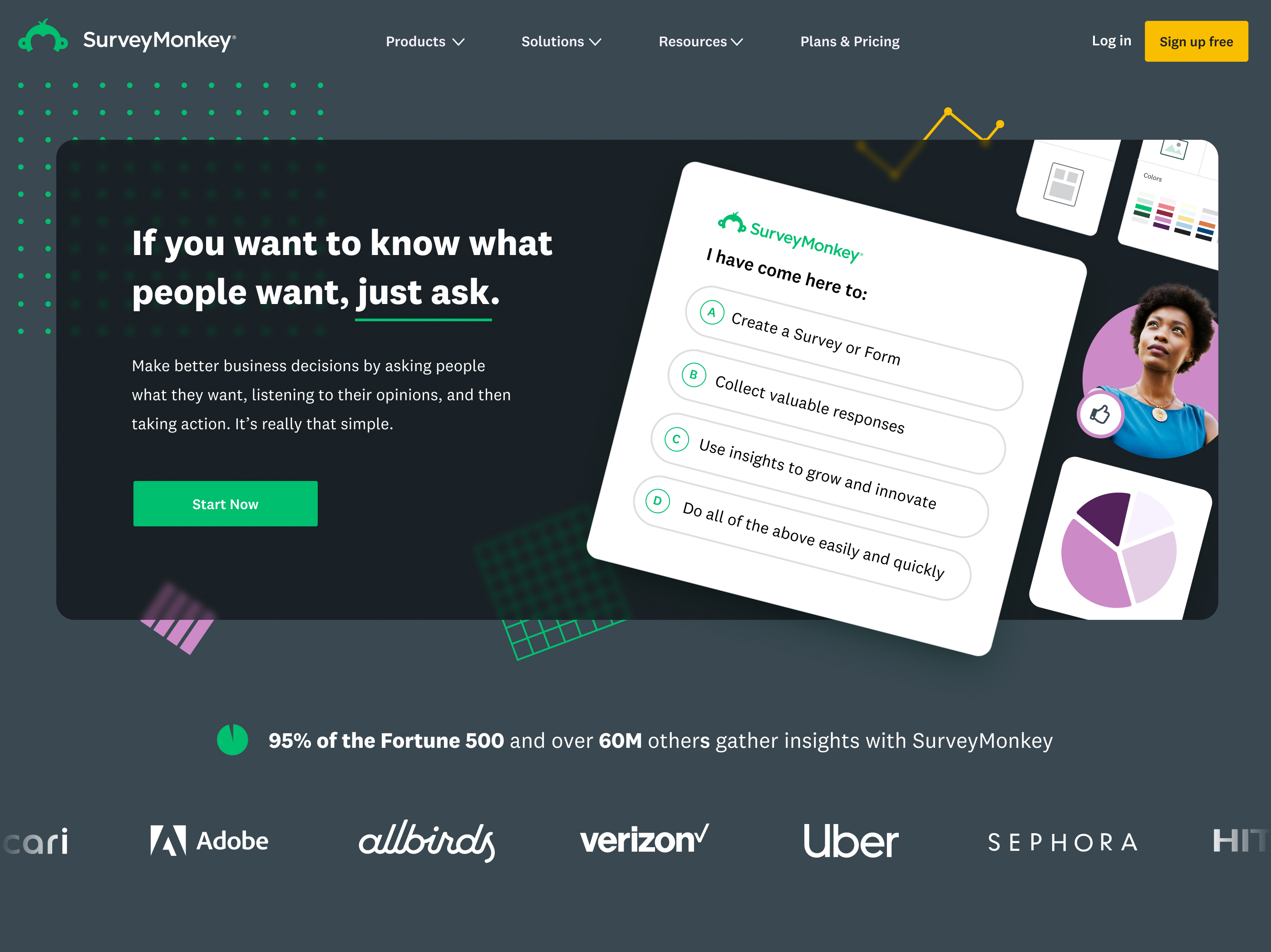
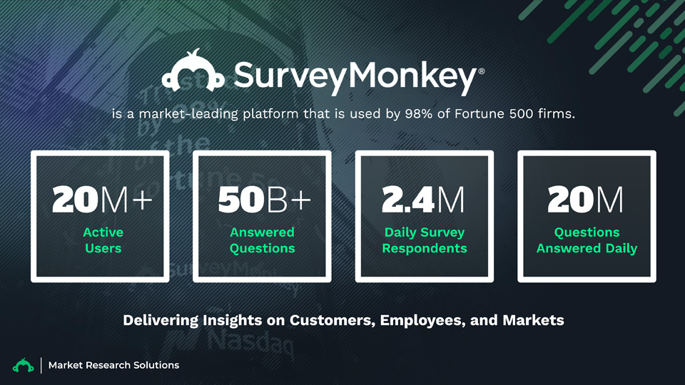
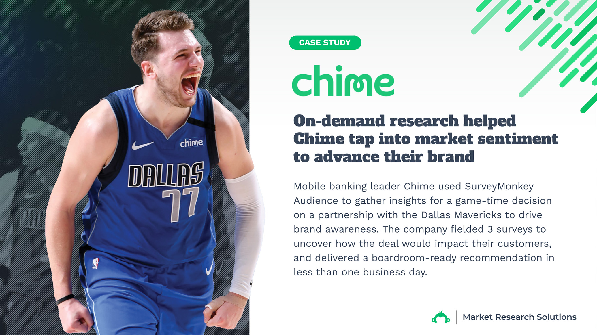
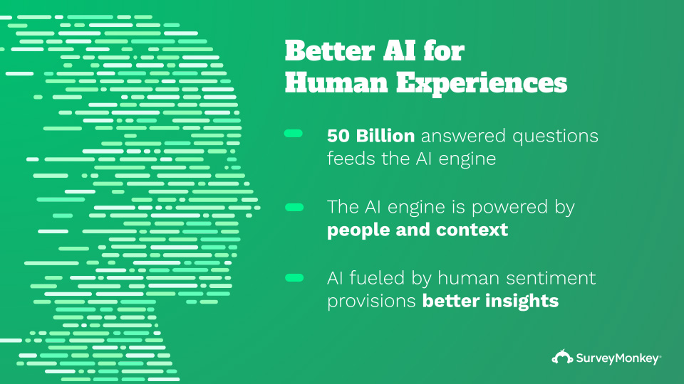
Getting the opportunity to redesign the homepage for a site that receives over 50 million visits per a month is not something that typically gets dropped in your lap. The bar for improvement was low, as the existing site content had remained stagnant for some time. I had a handful of interesting directions I wanted to explore. One in particular involved a bit of subtle interactivity that would showcase the product and market the value proposition at the same time.
The idea revolved around embedding a mock survey in the hero area with each mutltiple choice selection being a core user intention (the final answer being all of the above). A click on any of the individual answers would animate in a form response detailing the associated value prop. Each answer would laterally lead to each other value prop and inevitably end at the 'All the above' result with a 'Sign up for free' CTA.
I wanted the interactivity of the unit to be an easter egg so I skewed the axis of the form and surrounded it with graphics to emphasize it was a visual element rather than an actual working survey. To stay playful and define a visual style I incorporated animated paterns in the background that would move and rotate organically. As they passed under the hero module I would use an svg:filter to blur them to maintain legibility.
SurveyMonkey
Enterprise
SurveyMonkey was in the midst of a leadership change and brand reorganization. They spent the past few years building distinct business units for their consumer, enterprise and data products under the umbrella brand, Momentive, but the new direction involved consolidating the brands back into the singlular SurveyMonkey entity.
To recognize the re-org, it was necessary to launch an updates to key pages to reflect the change. It was an opportunity to change the creative that had not been updated for some time.

The SurveyMonkey Loop
Ushering in a new era
The core direction of the visual design was to incorporate more UI graphics to reinforce feature propostion, problem being that the presentability of product shots was lacking. The brand design team were designing UI mock-ups specifically for marketing use only. This felt disingenuous. Additionally these product shots were being incorporated as core visuals without any accompanying graphics which also felt dry.

Collin is a star. He is a unique combination of artistic talent and technical skill who cares immensely about how those elements show up for the customer. He helped define what our company stood for at LaneOne and was an invaluable resource for us at SurveyMonkey.