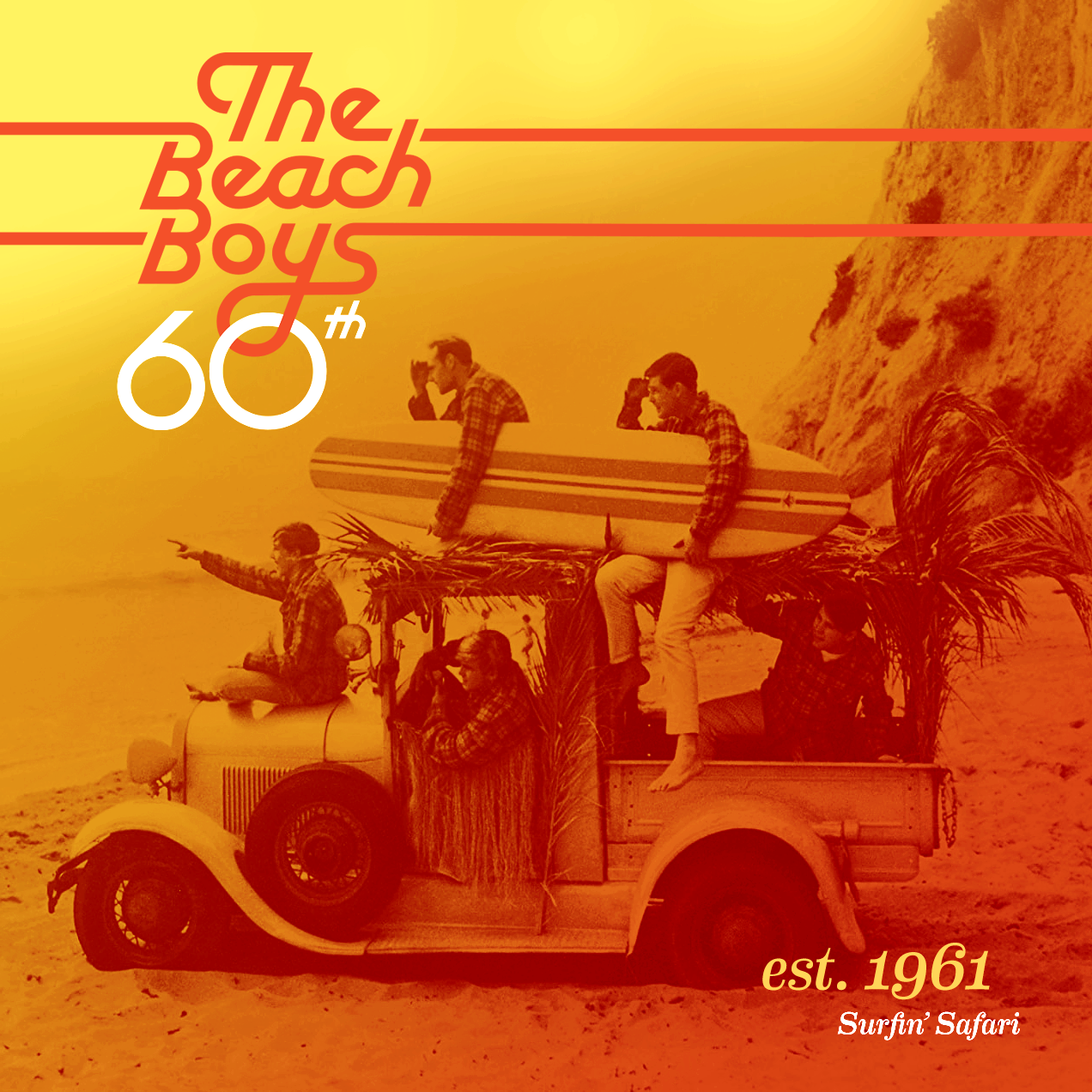
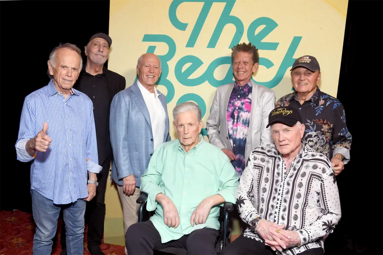
When I was a kid my dad would put Pet Sounds on the record player and I'd get lost in the complex and catchy harmonies. Decades later getting a chance to work with the band was something special for me. To commemorate the band's 60th anniversary I had the honor to redesign the logo that was last updated during the early seventies.
Initial logo concepts we're too on the nose. Using Cooper Black, the font from the Pets Sound's album cover, or mimicing type styles from late 60's surf culture made for a dated vintage look. These early explorations pointed us towards a direction that leaned modern but remained timeless and futureproof.
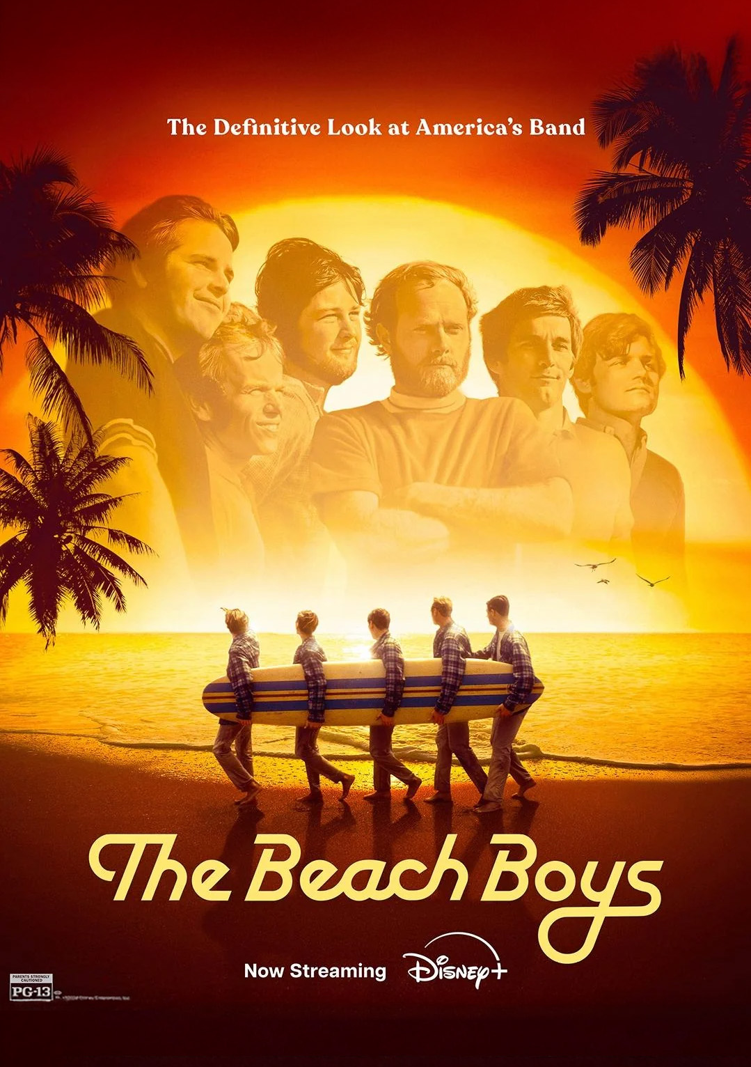
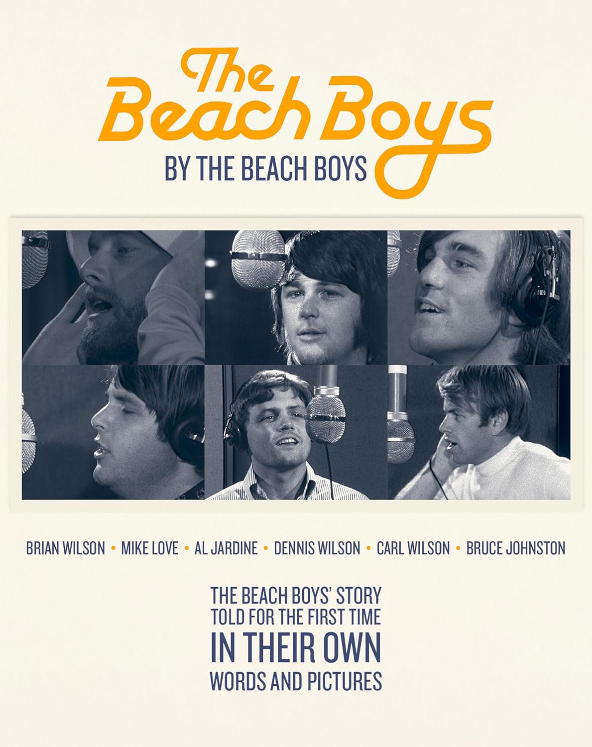
The Movie
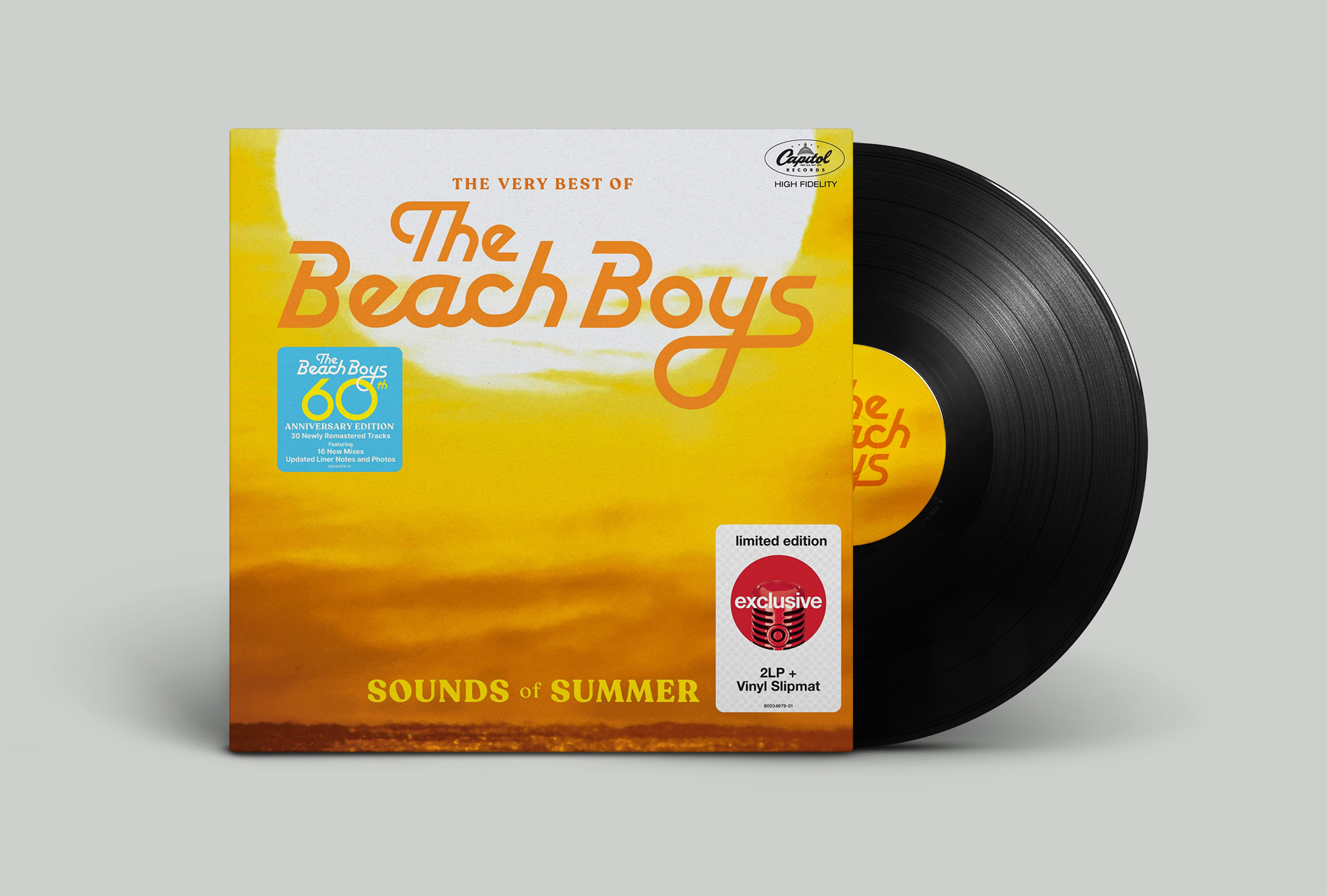
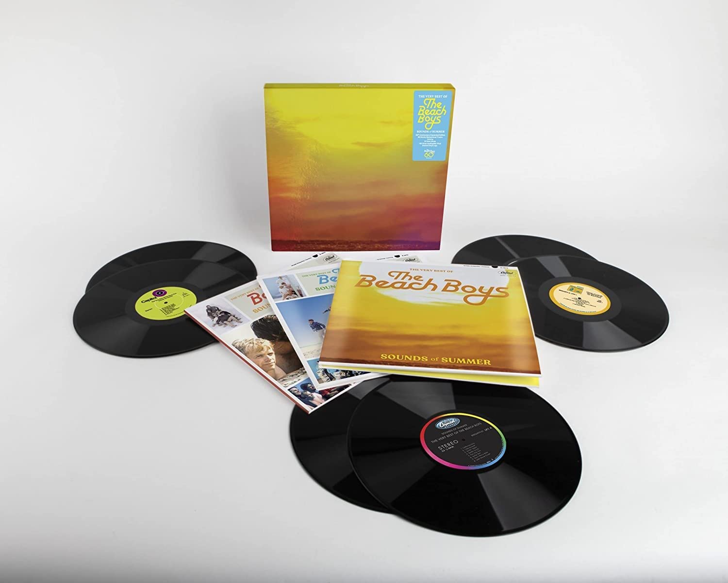
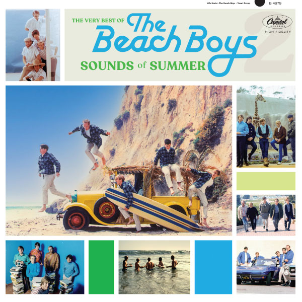
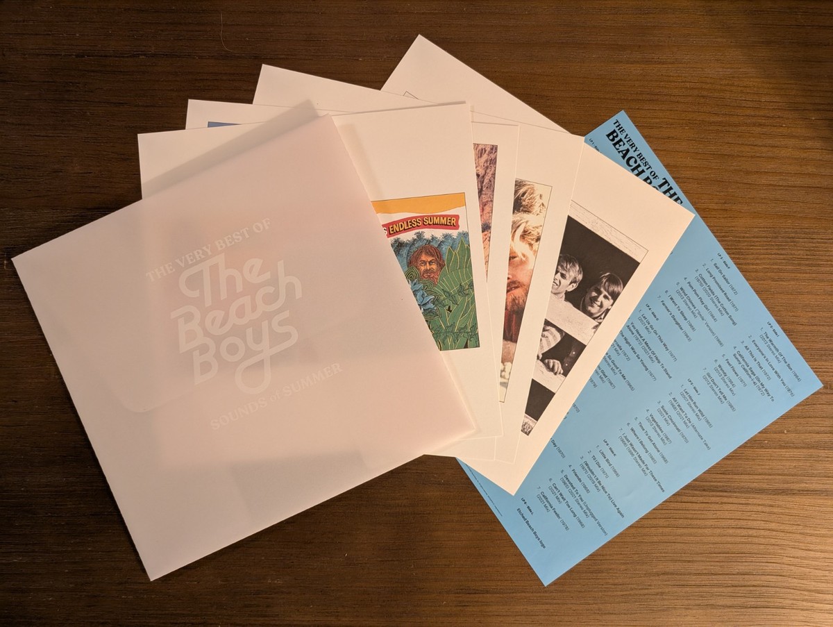
The first application of the logo was for the reissue of the Sounds of Summer, a compendium of Beach Boys greatest hits. There are many variations of this release, but I got my hands on a 6 LP version and was delighted to find a set prints enclosed in a vellum enveloped with the logo screened on. I love it, but maybe adding some white space around the logo would have let it breathe more.
The Album
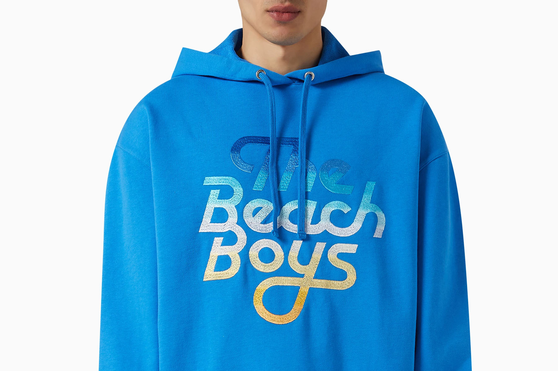
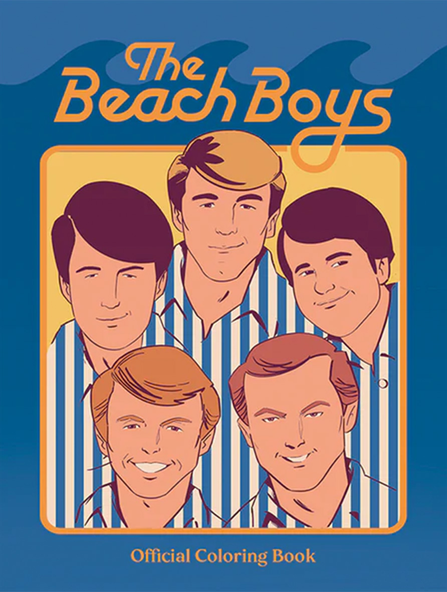
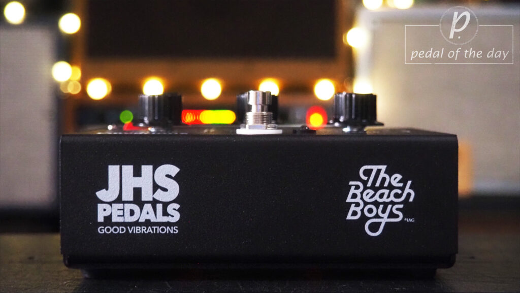
I don't think I've ever had a logo used on such a wide range of products. From apparel to coloring books to effects pedals, it seemed to have good of reach. It's always a trip to organically find your logo out in the wild. Below are a couple examples of it in use.
Officially Licensed Merch
I don't think I've ever had a logo used on such a wide range of products. From apparel to coloring books to effects pedals, it seemed to have good of reach. It's always a trip to organically find your logo out in the wild. Below are a couple examples of it in use.
Let's talk
I'd love to hear from you whether you need design support, want to leave a comment or maybe just say 'hi'. I'm currently available to work by the hour, on retainer or can offer a fixed project bid for budget flexibility. Hit me up!